


SUGOI SUSHI
BRANDING & PACKAGING DESIGN - 2021
The Sugoi brand recreates the enchanting ambience of a traditional sushi house, enhancing the guest experience with the choicest of delicacies, crafted for a connoisseur's palate.
The good folks at Sugoi strive to serve gluten-free fresh ingredients which are premium quality.
BRAND CONCEPT AND IDEATION
Known to have a Japanese origin, Sugoi (凄い or すごい ) is based on the kanji 凄 . It derives from the feeling of horrible excitement when one is confronted with something so overwhelming that the brain stops to marvel at it.
The identity has been developed inspired by the Japanese Kana writing system. The symbol comprises of the kanji 凄い along with it's English variant.
LOGO CONSTRUCTION EXPERIMENTS
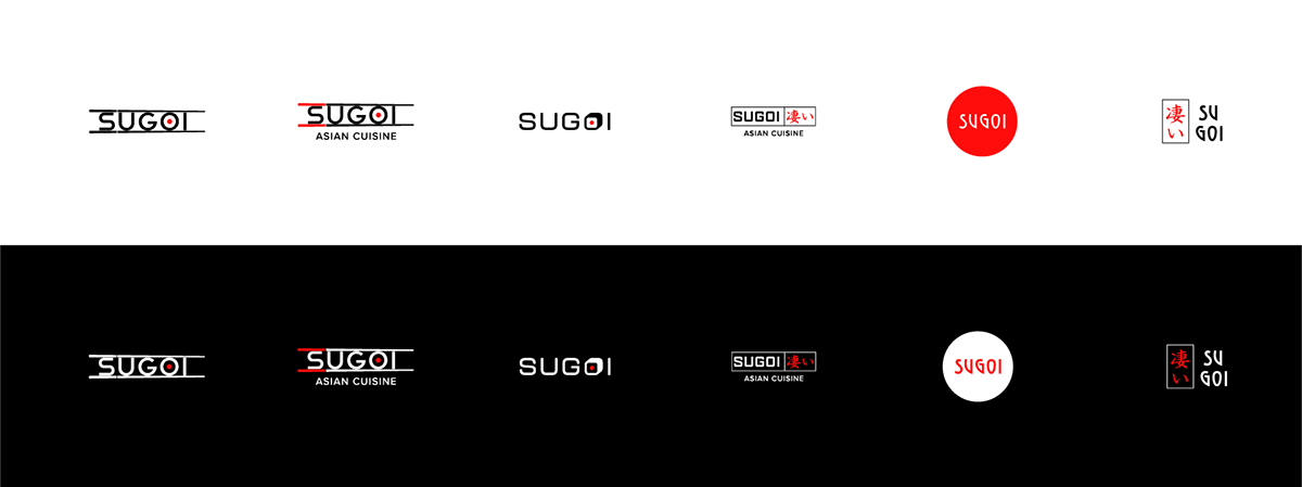
FINAL LOGO CONCEPT


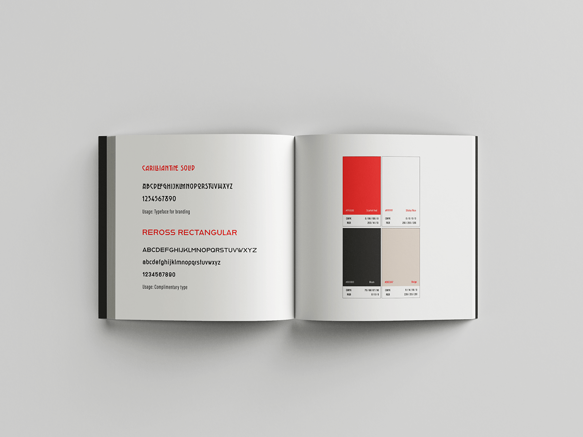
COLOURS AND TYPOGRAPHY


VISUAL LANGUAGE
The visual language was largely inspired by the Japanese culture, fresh ingredients and the vibrant colours of the produce.
The idea was to incorporate easily recognisable ingredients into the design.

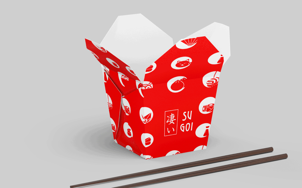
PACKAGING DESIGN
The restaurant menu and packaging incorporate a minimal colour palette to lay emphasis on design.
The Chopsticks Packaging comes in 9 variants, one for each motif. This serves as a fun element in the restaurant concept.

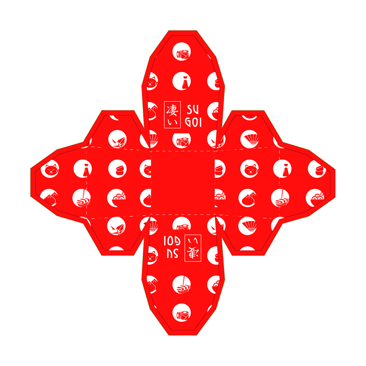
DIELINES FOR THE NOODLE BOX PACKAGING


The tabletop menu was designed keeping in mind brand values and brand colours.


The packaging for the takeaway boxes is a pattern created from the motifs of the visual language.
The two variants are clean, crisp and eye catching — sure to make a lasting impact.


BRAND COLLATERALS
Stationery Design including letterhead, business cards, envelope, document holder.


Design and Packaging by Anika Aggarwal
Disclaimer: This work was created to showcase the designer's skill, expertise and talent and will not be used for commercial purposes. All rights reserved. All art and graphic design material other than mockups are copyright of Anika Aggarwal and may not be resold, added to design or any other unauthorized form of distribution or reproduction without express written permission.


